Table of Contents
Successful landing pages are pages that enjoy high lead and sales generation. This article shows the 8 tips most successful landing pages use to generate higher conversation rates and engagement. According to Wikipedia, a landing page for online marketing is a single web page that appears in response to clicking on a search engine optimised search result, marketing promotion, marketing email or an online advertisement. “ A landing page is a standalone web page, created specifically for a marketing or advertising campaign” according to Unbounce. It is designed with a single objective of a call to action(CTA) for lead generation.
Landing pages are associated with social media, email newsletter campaigns, search engine marketing, effective articles that enhance the effectiveness of the advertisements. The major aim of successful landing pages is to convert site visitors into leads and sales. If the aim for the creation of a particular landing page is to obtain leads, the landing page will contain some features like an inquiry form or phone number to enable the visitors to have access to the company. While, if the goal of creating a landing page is to generate sales, the landing page will have a link for the visitors to click, which will give them access to a shopping cart or checkout area.
There are two types of landing page and they are references and transactional landing pages according to Wikipedia. A reference landing page presents information that is relevant to the visitors. It aims to isolate the visitor from any distractions and only provide the visitor with all available information about the targeted product to convince the visitor to take action. While a transactional landing page is to persuade a visitor to take action to complete a transaction by proving a form that needs to be filled out.
While every landing page is unique, there is a set of tips that all successful landing pages rely on to enjoy overall success. These include the following:
Keep It Focused (One Goal Only)
When it comes to landing pages, less is more. The biggest mistake people make is trying to do too much on one page. A good landing page should serve one purpose and have one clear call-to-action (CTA).
Imagine this: someone clicks on your ad for a free eBook about digital marketing tips. They land on your page… but then they see a link to your blog, a sign-up form for a newsletter, a shop link to buy your services, and even a pop-up for a webinar. It’s overwhelming. The visitor doesn’t know what to do, so they leave without doing anything.
Your landing page should have one clear goal not ten. Don’t try to sell a product and get newsletter signups and promote your social media all on the same page. That’s confusing.
Write a Clear, Benefit-Driven Headline
Your headline is the very first thing people see when they land on your page and you’ve only got a few seconds to grab their attention. If the headline doesn’t make sense, doesn’t speak to their needs, or feels too vague, they’re gone.
That’s why your headline needs to be crystal clear and focused on benefits, not just features.
Example: Weak vs. Strong Headlines
-
❌ Weak: “Welcome to Our Site”
-
✅ Strong: “Create Beautiful Landing Pages in Minutes No Coding Needed”
-
❌ Weak: “Online Course Available”
-
✅ Strong: “Learn How to Design Stunning Websites in 30 Days Even if You’re a Beginner”
See the difference? The second version in each case speaks directly to what the visitor wants and how it benefits them.
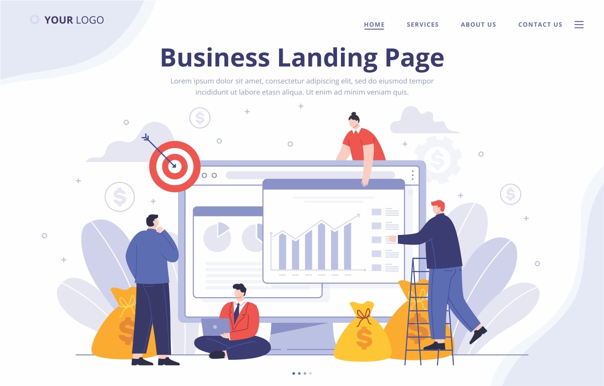
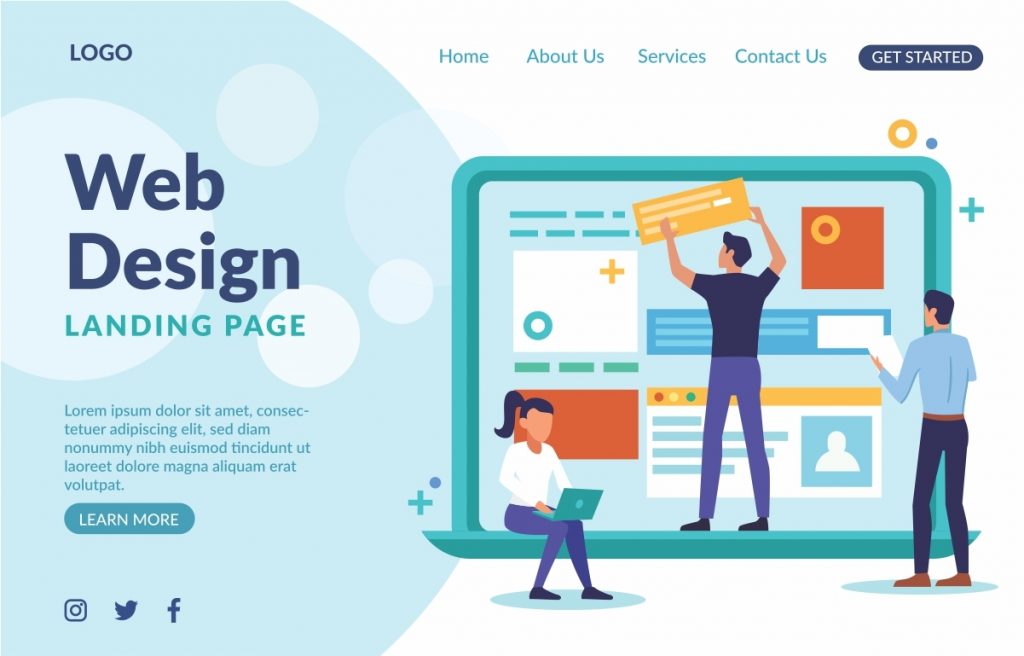
Use Eye-Catching Visuals
You know the saying: a picture is worth a thousand words? On landing pages, it’s more like a picture is worth a thousand clicks—if you use it right.
Visuals are the second thing people notice after your headline. Whether it’s a photo, video, or illustration, your visuals should do two main things:
-
Grab attention, and
-
Help tell your story.
What Makes a Visual “Eye-Catching”?
It’s not just about looking pretty. Your visuals should:
-
Support your main offer (show the product, outcome, or happy users)
-
Be high quality (no blurry, low-res images!)
-
Match your brand style and colors
-
Feel real authentic images often work better than stock photos
Make Your CTA Button Stand Out
Let’s be real—your landing page means nothing if people don’t click the button.
That little Call-to-Action (CTA) button? It’s the most important part of your entire page. It’s where all your headlines, visuals, and testimonials come together to say:
“Click this and get what you came for.”
Your button should sound like something exciting is about to happen—not like you’re filling out a form for the DMV.
Examples of strong CTAs:
-
“Start My Free Trial”
-
“Get My Free eBook”
-
“Book My Free Consultation”
-
“Join the Waitlist”
-
“See How It Works”
Avoid:
-
“Submit”
-
“Click Here”
-
“Enter”
These words are vague and uninspiring.
Build Trust with Social Proof
When someone lands on your page, the first thing on their mind is:
“Can I trust this?”
No matter how sleek your design or catchy your headline is, if visitors don’t trust you, they won’t click your CTA. This is where social proof comes in.
Social proof is all about showing that other people have already trusted you and benefited from it. When potential customers see that others have had a positive experience, it makes them feel safe to take the next step.
Why Social Proof Matters:
-
Reduces doubt and fear: People feel reassured when they see others vouch for you.
-
Makes your offer feel popular: If others are doing it, it must be good.
-
Boosts conversions naturally: Trust is often the missing link between interest and action.
Types of Social Proof to Use on Landing Pages
Customer Testimonials
- Short quotes from happy customers sharing how your product or service helped them.
Example:
“I increased my leads by 300% in just one month using this landing page builder. Highly recommend!” – Name ; Marketing Manager
Ratings and Reviews
-
Show your average star rating or number of reviews if you’re on platforms like Google Reviews, Trustpilot.
-
People love seeing social consensus before they commit.
Write for Skimmers (Not Readers)
Most people won’t read every word. Use:
-
Short paragraphs
-
Bullet points
-
Bold subheadings
📌 Highlight the most important benefits and use simple, friendly language.
In conclusion, not all successful landing pages convert the same. To have the best landing page results, research and adopt the best landing page practices to achieve a higher conversion rate.
This article was originally published in 30 March 2021. It was most recently updated in July 31, 2025 by Isah Progress