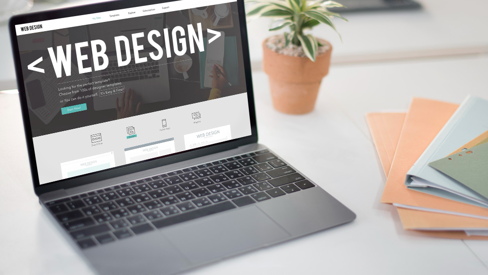
With the regular infusion of responsive design and relatively standard designs using grid layouts, the question of if you can prevent your website from being boring has recently popped up.
It is a good question that deserves an answer.
Let’s face it, over the past year or two the internet has become a much more visually pleasing place to be. With the use of responsive design to solve the problem of adapting a web site to various sized screens we have created an environment that tends to conform more to a specific style.
Combined with standard practices and common frameworks we have created a world of attractive sites that use many of the same site-building techniques that end up being familiar and easy for the end user to navigate, which is to their benefit.
But with the current minimal layout trend and standardization have we gone too far making websites in essence boring?
The Lack of Soul
The easiest way to sum up this phenomenon is to say that websites have lost their soul. Years ago the web had a lot of individuality. That was both good and bad. On one side of the coin you had innovation and creativity spurting like a fountain which eventually lead to things like responsive design, grid layouts and those clean lines that have become commonplace.
On the other side you had websites that looked like they were made by my 9-year-old. To be perfectly fair some sites looked even worse as my 9-year-old can be fairly creative with a good template design.
The bottom line is that now everything is starting to look quite similar, which is a disturbing thought because when everything looks the same, nothing stands out; that is not what you want for your business or your website.
Why the Similarity?
So why are websites more similar these days? A basic example would be that more sites are conforming to standard guidelines and schemes, much like homes that are part of an HOA. The upside is that the neighborhood generally looks better as you have limited options on paint colors and need approval before parking an RV on your lawn.
Limited layouts are one similar aspect which is directly related to responsive design so that consumers can cruise your website on a phone, tablet or desktop easily. Really there are only about a half-dozen basic starting points when looking at what we consider standard grid layouts that work well responsively.
You also need a site that can look great at any resolution because again, you are working with multiple devices and screen sizes.
Frameworks are extremely popular because they not only made the design process faster but they are a safer choice that uses common elements that people are familiar and comfortable with. This leads to very similar use of code, layouts and the like on projects even those done by different firms.
Finally there are large pools of free photos and images out there to use. But even with the size of that pool what tends to happen is that new images added to the pool share similar aspects to existing items and even then the most popular images get reused over numerous sites.
Bucking the Trend
So how do you buck the current trend the design world has fallen into? Keep in mind that a trend is not a bad thing at all. Culturally we shift through trends on a regular basis and it is completely normal. Just think of the difference in clothing or music from the 70’s, 80’s and 90’s as an example.
What is happening right now is that what people see, like and tend to copy or gain inspiration from is pushing the same trend which in turn makes it harder to stand out.
How do you buck the trend?
Now more than ever is the time to partner with an innovative, highly creative, award-winning designer that will help your brand find its voice on the internet. That means discovering the soul of your company and then crafting a customized design that is unique while still following some of the common rules of navigation and responsiveness that users have come to expect as the norm.
A great designer can:
- Take an existing layout and transform it into something you haven’t seen before
- Utilize alternative geometry to get out of the box
- Code new frameworks that are unique to your project
- Adding unique design touches that still fit in with common scrolling and breakpoints
- Variable color schemes that change for each visit
- Use more than stock images
The bottom line is that to stand out you need to combine creativity and innovation with what is considered standard practices. You want to take a step forward with individuality while at the same time not taking any steps back with a wonky user-experience to ensure that you prevent your website from being boring and getting lost along the information superhighway.
This article was originally published in 17 June 2017. It was most recently updated in November 18, 2024 by Wise


