Table of Contents
A web design firm, a creative agency and a software vendor walk into a client’s office. The client asks, “How often should we redesign our website?” The agency replies “every two years.” The software guy says “every five years” The web designer says…
This isn’t a joke. I was actually in this meeting. There were eight people from four companies in the room. My answer at the time was four years. My standard answer has always been 2-5 years, depending on the industry. But that’s a big range.
Since then, we’ve done some research to really answer the question…
What is the average lifespan of a website?
We took the top 200 marketing websites according to Alexa and looked them up in the Wayback Machine. We looked at the design and structure of each site over many years, and we determined the interval between major website redesigns for each site.
The average website lifespan is 2 years 7 months. Actually it was 2.66 years which is 2 years, 6 months and 27 days, but close enough.
The 10 Website Life Expectancy Factors
These are the main factors that determine how fast your site ages. Some are related to changes in your business. Others are about changes to the web and in visitors’ expectations.
Ask yourself each of these questions counting yeses and nos. The more time you answered yes, the more likely your site is showing its age.
- Has the main message of my business evolved?
- Has my content strategy changed? (I’m now doing more publishing, events, promotions, etc.)
- Has my industry evolved? Are people in my business talking about things differently these days?
- Am I in a design- or technology-related industry? Times change faster for these businesses
- Is my site keeping up with design trends? Modern sites tend to be streamlined into a single column layout. They present less information at each scroll depth, with larger images that often fill the screen. The trend is toward more video and more prominent calls to action.
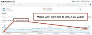
- Does my site look great on phones and tablets? If your last redesign was 6 years ago, it’s possible that most of your visitors are using completely different devices today

- Is my site hard to update? Content management systems have improved. We should have higher expectations for easy updates. These days, it should be fast, free and easy to make most changes to the content on our websites.
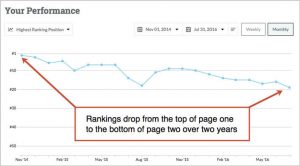
- Have my rankings and search traffic declined? Unless you are actively promoting your website, rankings tend to decline over time. A redesign can reverse the trend of declining search traffic through a new keyphrase-focused sitemap, with new pages targeting new phrases.

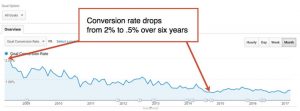
- Is my conversion rate declining? Visitors’ expectations keep increasing, so unless your website keeps improving, conversion rates tend to decline. A redesign can reverse the aging process through a new, conversion optimized design that exceeds visitors expectations.

- Have my competitors recently redesigned? This is the big question: What are your competitors doing? Let’s take a look…
Age is relative …to your competitors
Try this: pretend you are a potential lead or customer. Search for your product or services. Seriously, press pause on this blog post and go take a look! What did you see?
- Who is ranking?
- Are their sites newer than yours?
Your potential customers see those rankings and those websites many times every day. While you are reading this, at this very moment, someone is looking at those search results and those websites.
Old and new in that context. It’s all relative.
How to extend the lifespan of your website
There are ways to take months or years off the look of your website. Here are a few tricks to reversing the aging process:
- “Content Injections” Adding new writing, images or video can make a site look young again. It’s a smart move because these assets can be used in the eventual redesign down the road.
- “The Haircut” Trim the navigation by removing the links that people click on the least. You can find these links in the Navigation Summary for any page in the Behavior > Site Content > All Pages report in Google Analytics.
- “Nip and Tuck” Tighten up the design with a few style-sheet changes. Refining the type (snip snip) and tweaking the color palette (snip snip) can bring things up to date with your brand.
- “Face Lift” A homepage redesign will make the site seem fresh for new visitors. But it’s a temporary fix since big changes can put the homepage out of alignment with the rest of the site.
- “Page Enhancements” Like the face lift, add a new template layout that takes advantage of modern design trends. This targeted procedure can focus on trouble spots where aging is worst. Use the template on your highest traffic pages and top exit pages.
“I HAVE A WEBSITE, BUT PLEASE DON’T LOOK AT IT.”
Ever heard someone say this? They’re so embarrassed of their web design that they don’t want anyone to see it. They want to hide their most important marketing asset. At this stage, the website is actually hurting the business.
This is the end. It’s time to pull the plug.
Bottom line
When you, your business or your visitors change, your website ages. It’s old as soon as it’s out of sync with your business and is not getting you those measurable results. Keep it as young and fresh as possible, but be ready to make the tough decision to redesign. And when you do, think ahead as far as possible.
This article was originally published in 10 May 2017. It was most recently updated in November 28, 2022 by


