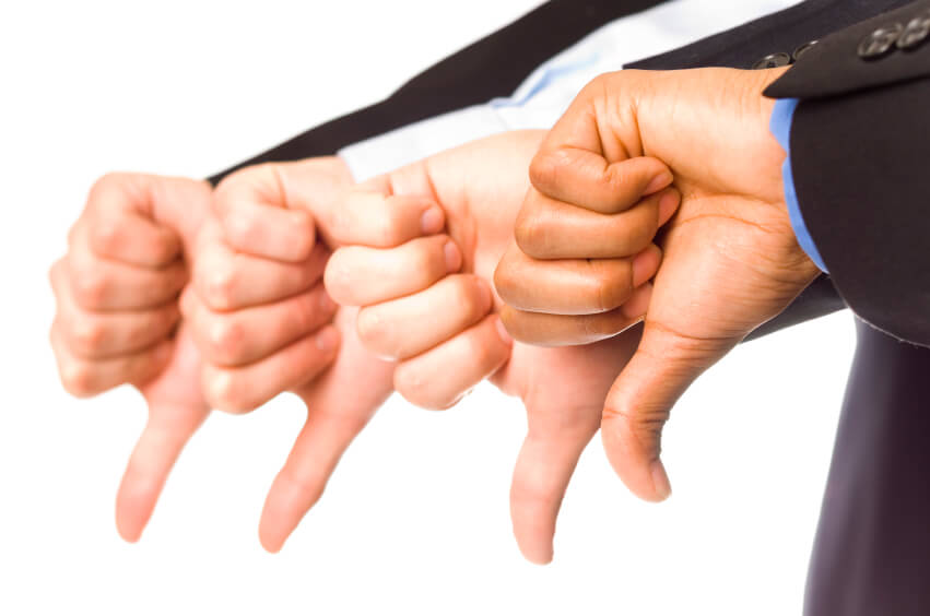
While many people like to be included on lists, the Worst Mobile Apps of All Time is a list that developers would rather not be a part of. However what you have to remember is that from failure often comes success which is something most mobile app developers can attest to.
Failure is not the opposite of success; it’s part of success. ~Arianna Huffington
So while this is a list of some of the worst mobile apps of all time, rather than looking at them as just a failure we should also try and see what we can learn from those failings and then apply that knowledge to the next project.
Worst Mobile Apps of All Time
- Google Allo and Google Duo – The list starts strong with a pair of apps Google released in 2016 that were going to revolutionize how we use our smartphones to chat with each other. Allo was a basic messaging app that was touting the ability to use emojis, art, variable text size and more to help customize the chat world. Duo was a video chat service meant to work with Allo to cover all your messaging needs. Why is it on this list? Google failed to ensure that the services would work with other services such as the inability to chat with people on Hangouts. Additionally the idea that people would completely abandon other successful apps like Hangouts, Facebook or Snapchat for a rather vanilla offering from the tech giant was a bit short sighted.
- Tweetpee – Looking to expand the use of data sensors, this app allows you to attach a sensor to a kid’s diaper. When the child urinates it will alert the app and send you a Tweet. Why? Why does this app need to use Twitter? Why can’t it just message you directly? This is another example of a design flaw where an idea gets taken too far rather than keeping it simple. Really, the Twitterverse does not need to know when your child urinates.
- Floating Miley Cyrus – This app does fill a very particular niche: people who want to see a small image of Miley Cyrus dance using the same moves over and over and over and over and over. This app again is extremely pointless. Even young fans of Miley have nothing to work with. It would have nice if there were variations of outfits she could dance in or different moves depending on mood to at least have some variations. The point being if you are going to code a one-trick-pony that trick better be amazing.
- Peeple – Dubbed the Yelp for people, this app was geared to help people rate and recommend people you know. The design itself was fine, but again the concept was rather flawed. Who exactly is the target audience for this app? Where is the need for this app? On top of that, where is the oversight for potential abuse? This social platform looks like a bait station for trolls and bullies.
- I am Important – An oldie but a goodie, we have the narcissist friend known as I am Important. Released back in 2011 this app is basically a dinosaur in regards to design. While the design itself was boring and bland, it is the concept that landed this app on the list. Basically the app would create fake contacts, events and the like to help someone somehow feel important.
- iAmAMan – This app was designed to help men trace and track a girlfriend’s menstrual cycle. Do we really need to go on as to why this is a bad idea? If this app was designed for women to help track their cycle for informational purposes and/or to help with pregnancy then that might actually serve a need, however again we have an app that was coded for an unknown audience to fix a non-existent problem.
- Funny Hand Dryer – This app attempts to simulate the sound of an air hand dryer that you would find in a public bathroom. We have no idea why this is considered funny. This app is loosely considered a game but seems more like it was a coding project for a college course that somehow made its way to an app store.
- Will you marry me? – This app actually makes the list for multiple reasons. From a design standpoint it is simplistic and boring at best. It is hard to read and limited functionality. Next we have the actual premise of using an app to propose your undying love to someone. Again, this is a need that nobody has expressed a desire for. Finally we have the functionality of the actual proposal and response, which again was limited, hard to read, and boring.
What Can We Learn?
The sad thing is that this is just a very short list of the worst mobile apps of all time. There are a ridiculous amount of contenders for this list coded each and every year. From Beef War to 99 Bottles there are far too many awful apps sitting at the bottom of the app store bin.
But what can we learn from these heaps of coding mishap?
First and foremost is that not all ideas are good ideas. Your goal should be to solve a problem or fulfill a need that is out there, and not just in your own head. Market research is always a good idea so you can establish if there is an existing need and then who the optimal market is for your product.
Next we can gather that the actual coding of apps is not nearly as important as the design. The interface, including options are imperative to the overall experience a user has on the app. So with that in mind make sure you have an experience app developer on staff.
The bottom line is that there will always be a best and worst in any category. The worst mobile apps of all time are an interesting and highly subjective group of applications that swung a missed badly. But from those failures success can be found if you take the time to learn from their mistakes.
This article was originally published in 2 May 2017. It was most recently updated in November 28, 2022 by


