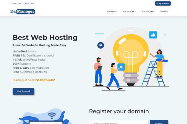
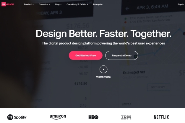
14 features your website’s homepage must have are features that are capable of retaining or losing your website visitors when they visit your web page. According to Wikipedia, the homepage is the web page of a website that a visitor navigates to from a search engine and can serve as a landing page to attract visitors. The page is seen in a web browser when the application starts up.
The website’s homepage is the company’s virtual front door, web visitors access within a matter of seconds and is responsible for retaining or losing a majority of the website’s traffic. Your homepage needs to enticingly introduce your products or services to your web visitors and encourage them to explore your website further. Every time new web visitors visit your website’s homepage, your business undergoes “a job interview” with them. This is why it is important to know the 14 features your website’s homepage must have before venturing to build a website.
Many website users give a quick critique of what they see in detail when they visit your web page, which formulates the opinion they create about your business to ascertain if your brand is worth getting to know any further or if it should be dismissed immediately. Despite the website’s homepage being prominent, many businesses struggle to optimise it properly.
There are several must-have elements that every website homepage needs to have and below are the 14 features your website’s homepage must have to be optimised properly.
- Logo: Your logo is your core business’ branding and identity. It should be visible at the top of your website. It serves as a constant reminder for your clients to recognise and connect to your business. The logo is usually placed at the top left side of your homepage and can double in functionality as a link to the homepage. Give your logo ample negative space so it can stand out alone. Do not crowd your logo with unnecessary visual elements. The size of your logo should be concise and not elaborate.
- Navigation: The navigation menu should be easy to find through proper itemisation that makes sense to new visitors. For a website, the navigation is like a guide or road map that gives visitors an overview of the site’s content and also aids them to locate the information they are searching for. To reduce bounce rate, descriptive and thorough navigation should be used to enable your visitors to have a clear path to your site from your homepage.
- Headline: The website headline should be clear, simple and within 2-3 seconds needs to tell the visitors what the site has to offer. The headline must have a sub-headline or paragraph text that describes your business and the services you render. This is usually 2-3 powerful precise and concise sentences that target your viewers’ needs.
- Provide Simple Value Proposition: Give a simplified tone of what your company does, who your services are for and what makes it different from others. Make your value proposition easy to find to make your visitors stick around to find out more about your company and services. If your company’s value proposition is vague, you will lose most of your web visitors who may likely not visit again.
- Contact Information: Provide contact information that visitors can easily find on your homepage. You ease your web visitors worry when you make this information readily available and easily accessible. This helps to prove that the business is a legitimate one and will increase the number of people who will be willing to work with you.
- High Quality Supporting Images: Use images that show credibility and are related to the content of the web pages. Using the right images helps to keep the audience engaged. It shows professionalism and proves the company is capable of paying attention to details. Thereby, making it easy for people to work with you. Using wrong or low-quality images is capable of making you lose your web visitors almost as soon as they visit your website.
- Overview of Products/ Services: Provide a brief overview of your products and services to aid you in securing web visitors’ trust gradually. This feature is important to build good content for your web page. It helps to make your website page rank better when those products and services are searched for in search engines. This feature also helps to influence the web visitor’s decision making.
 Simplified Call-to-Action: Your call-to-action button should be easily comprehensible, specifying the action(s) you want your website visitor to take. Having many call-to-action buttons will confuse your visitors and kill their interest in taking any action at all. It is ideal not to have more than 3 call-to-action buttons.
- Link to Social Media Accounts: Adding links of your social media accounts to your homepage, increases your brand’s awareness on all social media platforms your business belongs to and also help your prospects keep tabs on your company’s activities. This makes your website visitors easily find your brand on social media platforms, engage in your company’s activities and keep your social media accounts active. By so doing, your business constantly remains familiar to your prospects and keep them returning to you.
- Clients Testimonials: Research has shown that when a brand can provide testimonials reviews from satisfied clients, 79% of new visitors easily trust that brand and seek to close a deal with the said brand almost immediately after seeing its accomplishment. This feature does a convincing job for the brand to bring new clients in. Without it, sorting for and retaining new clients will become a difficult task. Many first-time web visitors use this as a yardstick to determine if the business is legit and if they can do what they are proposing. So with testimonials, you are telling your clients that you are not just bragging but can do the job.
- Include Blog Highlights: By including your blog highlights, you indirectly encourage your clients to visit your blog and subscribe to your blog post. Therefore, bringing more traffic to your website. When you add your blog highlight, you will have a more possible number of people who will read your blog post. This feature helps visitors to also convert and start a relationship with your brand.
- Include Awards and Certification if Any: Adding this feature gives your website credibility, shows the quality of your work and proves your brand identity as an expert in that particular field and also a business brand that people can trust and partner with. This show that your work lives up to expectations.
- Add a Resource/ Tutorial Center: Many people who visit your web page for the first time may not want to initiate a business conversion but might be glued to your resource centre and after spending some time there to satisfy their curiosity may return to the homepage to strike a business conversion with your brand. So by offering them a resource centre where they can learn more, you are keeping their interest in your page and as such, they become your lead generation.
- Include Benefits: Adding this feature quickly inspire your web visitors to give your brand a trial. This feature serves as your bargaining chip to lure your prospects in. New prospects want to know why they should do business with you, so when you add your benefits you have the advantage of being chosen if your benefits are satisfactory to them.
The 14 features your website’s homepage must-have is crucial to having a successful web homepage. Quickly check yours to see if your website’s homepage has all the above-mentioned features. If yours omit some of these features it means your web homepage needs optimisation. Do you want to redesign your homepage or any part of your website? Then talk to us today at Da-Manager platform and let us give your website the best optimise features it needs to succeed.
This article was originally published in 26 July 2021. It was most recently updated in November 25, 2022 by Wise


