Are you considering a new logo for your business in 2019? Whether you’re in the middle of a logo design process, revamping your existing logo, or just starting to think about your visual identity, there are common mistakes you can learn from. Want to know the common logo design mistakes you need to avoid? The details contained in this infographic will help you to know those mistakes to avoid and what to do.
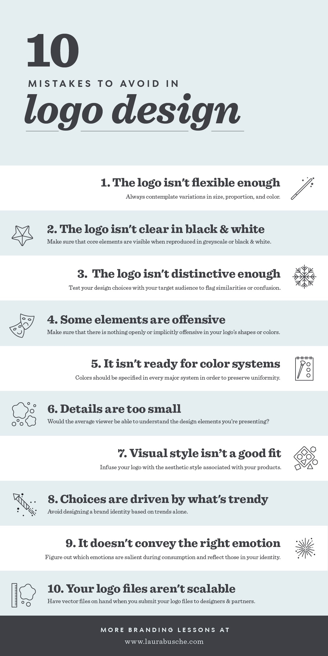
Red website shares their tips for logo success in this infographic.
Here’s a quick summary:
1. Your logo isn’t flexible enough
2. Your logo isn’t clear in black & white
3. Your logo isn’t distinctive enough
4. Your logo is offensive or discriminatory
5. Your logo isn’t prepared for various colour systems
6. Details are too small / hidden for the naked eye
7. Your logo’s visual style is detached from the product
8. Your logo’s design choices are driven by what’s trendy
9. Your logo doesn’t convey the right emotion
10. Your logo files aren’t scalable
Check out the infographic for more detail.

=========================================================
Thanks for reading this post! Don’t just read and leave,
please like, follow me, and share with others too!!…
=========================================================
This article was originally published in 7 January 2019. It was most recently updated in November 24, 2022 by


