Are you in the process of creating a new website for your business? Trying to decide upon the best colour scheme to use?
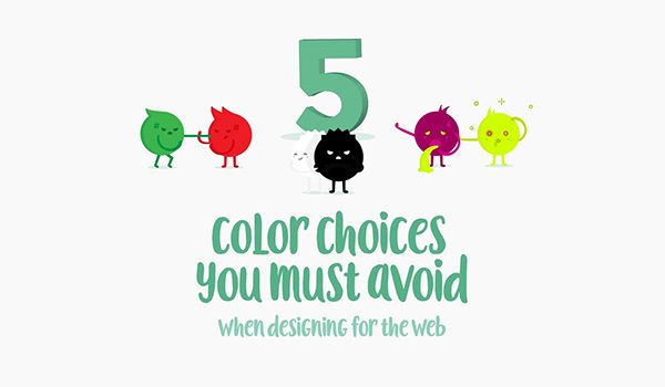
Creative Market share 5 colour choices to avoid in this info-graphic.
Here’s what makes their list:
- Pure black
- Red and green
- Neon colours in UI elements
- Light colours on white backgrounds
- Bright colours with more bright colours
Check out the info-graphic for more detail.

This article was originally published in 20 January 2018. It was most recently updated in November 28, 2022 by


